Apart from designing some of my interests include doodling, illustration, sketching random ideas, and cooking something interesting.🎨 I believe these activities are not only a stress reliever but also part of my Ikigai. I also enjoy reading interesting things in design, psychology, and non-fiction.📗 Click on the images below.
Transforming the onboarding experience of enterprise dashboard of Johnson Control
In this case study, I am going to share my process and concepts that went about in the design of the onboarding experience for Exacq Vision platform.

Overview
Exacqvision is a video surveillance platform used to control the system and recording settings of the security cameras.
This focus of this project was to enhance the onboarding experience for Johnson Controls integrators installing and setting up ExacqVision video management software. Through user-centric design, the aim was to streamline the process, alleviate pain points, and distinguish Johnson Controls in the market by boosting integrator satisfaction and empowering end-users.
Type
Industry project-
Capstone
Client- Johnson Control
My contribution
Team
Timeline
Responsible for research, interface design, prototyping, testing, stakeholder interviews and team coordination.
2 UX designers,
3 Researchers
Coordination with Jhonson control team of 3
11 months
GOALS
Design Objectives
Guide the user about the functionalities
Simplify the experience in a step wise process
Clear and intuitive guided experience
EXPLORING THE LANDSCAPE
Research and exploration
To understand the problem space better we first went through some secondary sources like analysing the design of similar applications. We went through the company tutorials or guides online on Exacq Vision platform. Analysing similar applications based on it's onboarding and user friendly prompts if any, gave a good starting point to approach the design.
We also conducted primary user interviews and then mapped the insights in the form of affinity mapping. Below is the process that we followed.

Addressing user pain points
To understand the problem space better we conducted 4 primary interviews of some of the employees of Jhonson Control who were familiar with the Exacq Vision. We then mapped those insights using affinity mapping.

To understand the problem space better we conducted 4 primary interviews of some of the employees of Jhonson Control who were familiar with the Exacq Vision. We then mapped those insights using affinity mapping.
Typical user persona of an Integrator is considered below. Key job of an integrator is to setup the security cameras and adjust their settings based on the requirements of different spaces.

CURRENT UI AUDIT
Understanding the current design
In order to understand about Exacq Vision and it's functionalities, the Jhonson control team shared the access to the platform and the training manual that is given to the integrators.


The current training manual for Exacq Vision

We were provided with a separate system to login into the Exacq vision platform and go through the current user flow.
Key flows that we discussed to focus on-
1. Initial Onboarding
2. Add Systems
3. Add IP Camera
4. Guided dashboard for key functionalities
5. Scheduling camera recoding
6. Storage settings flow

One design constraint was that the design could not be changed all together. The flexibility of changing the original interface was limited.
WIREFRAME
Initial conceptual design
To start with the ideation for the user flow, I started with creating wireframes on the sketches and low fidelity wireframes on figma. This enabled to get the ideas tangibly out there.

Ideating the flow on whiteboard

Low fidelity wireframes
FEEDBACK
As I discussed the low fidelity designs with stakeholders, I got some some feedback in terms of streamlining the experience. Some of the key points are below.
❌ Not to provide the login/signup after splash screens instead before entering the web-app.
✅ Simplify the experience for the settings of scheduling for each recording cycle and storage for different cameras recording.
✅ Interactive experience with guided dashboard. Ability to skip or close.

VISUAL DESIGN
Shaping the design
Key concepts in the solution
While shaping the design, the key idea was to provide an intuitive yet guided experience for the integrators. Below, I have shared the key problem and the idea or solution to solve it. Due to non disclosure of the entire design only the key concepts designed have been shared below.
Splash screens
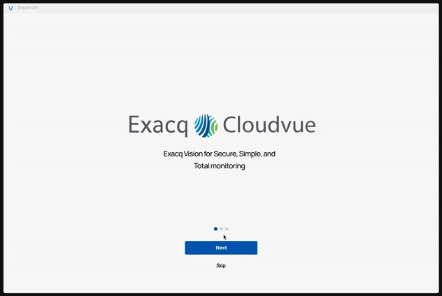
Problem - Lack of an intro of upcoming features on opening the web-app
Solution- Informative Onboarding splash screens
Dashboard Tour
Problem - User's feeling lost of how to go about the performing setting up details
Solution - Guided dashboard tour highlighting key Functionalities

User Feedback

Problem - Inadequate feedback or updates
Solution - Feedback and system status at every step of the process
Setup Wizard
Problem - Unclear flow of the steps
Solution - Step-wise process using a pop-up wizard for adding cameras and system details

Simplified Scheduling

Problem - Complex schedule process
Solution - Simplified scheduling process by providing customizable options for every cycle
USER TESTING
Evaluation
For user testing we primarily tried to understand participant feedback by understanding the ease of task completion and errors if any. We tested the prototype with 4 Johnson control employees who were familiar with the platform, and with 2 novice users. Some of the key insights were as follows.

Changes done post testing
Post the testing we optimized the design in terms of button consistency, color update for the secondary button, optimizing text alignment across the design, close button on the dashboard guided tour popup.
Future scope for the design
-
Guidance within the application using a AI based chat bot.
-
Introducing animated video tutorials within a guided tutorial framework, providing users with a visual and interactive learning experience for the set up.
LEARNINGS
Reflection
✍️ Test concepts early
Clarify product requirements and discuss concepts before diving into key screen design.
🤝 Team coordination
As a lot of times the team worked remotely on this project one of the learning was to over-communicate as one updates and works together.
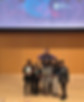
✨ Capstone Win
In the capstone presentation for Human Computer Interaction (HCI) graduates Dec 2023, the team won the: 1st finalist for the for the HCI and Web app categories.

🎉

That's me!

You made it till the end of this case-study!