Apart from designing some of my interests include doodling, illustration, sketching random ideas, and cooking something interesting.🎨 I believe these activities are not only a stress reliever but also part of my Ikigai. I also enjoy reading interesting things in design, psychology, and non-fiction.📗 Click on the images below.
As a Product Designer at Clinikk Healthcare, one of the key projects that I worked on is the design of the ticketing system. In this case study, I will provide an in-depth exploration of the design process I followed unraveling the 'why' and 'how' behind the design decisions.

BRIEF
Overview about the company, project and team
Clinikk Healthcare is a health tech startup offering low cost membership based health-insurance plans along with primary care and tele consultation for blue-collared workers.
This is a project where I worked on shaping the ticketing system for doctors and health assistants for the internal dashboard of Clinikk Healthcare centers to coordinate consultations and other tasks via creating tickets.

A ticketing system is a centralized system where tickets can be created for specific type of tasks. When someone creates a ticket it is assigned to a particular member of the team. The ticketing system also shows the status of the tickets.
Type
Enterprise Dashboard
My contribution
Feature ideation, primary research, design, prototyping and testing
Team
Head of Design,
Product Manager,
2 Software Developers
UX Designer (My role)
IMPACT
45%
Estimated reduction in coordination time and errors between doctors and health assistants.
56%
Improvement in task completion for health assistants post testing.
DIVING DEEPER
Understanding the user needs
As there were several coordination issues between the health assistants and doctors, to dive deeper into the problem space, we created a research plan to understand the user needs better by conducting primary interviews. Below are some of the questions that we asked-
-
Can you share what is your typical schedule in a day like?
-
What are the primary reasons to call the customers?
-
What are the typical steps followed in follow-up and feedback calls?
-
Can you share which tasks you track on Google sheets?
-
What are the current challenges in coordination?
We interviewed 3 health assistants and 2 doctors to understand their current issues and needs because there were several coordination issues.
Below are some of the key insights from the user interviews-

Health assistant (HA)

Doctor
✦
Currently, the health assistants used a Google Sheets file to track the calls to be made which lead to excessive manual work.
✦
The doctors coordinated on messaging platforms with health assistants.
✦
The HA has to check or confirm who is the head subscriber manually.
✦
The doctors were not able to track the appointment feedback and history of previous consultations
✦
Patients would often give preference to doctor based on language and gender.
✦
Certain tasks or calls need to marked as urgent for the doctors.
✦
Maximum 3 followups done to a patient incase the call was not received.
WIREFRAMES
Brainstorming low-fidelity layouts
As the ticketing system feature being a new feature to be introduced within the operations dashboard, I started by creating a few conceptual wireframes of ticketing card layouts of the dashboard. Below are some of the
key wireframes.
✅ Single column of ticket list, focus on one ticket at a time
❌ More number of tickets with single column view

❌ Two column view for the ticket list
❌ Clickable ticket board that are pop on hover
SHAPING THE DESIGN FLOW
Iterations and team collaboration to optimize the design solution
In order to shape the design flow I started by creating a user flow for different ticket types, I started with creating the initial versions of the design. After each interaction I discussed the designs with the head of design and PM or health assistant for feedback on it. Due to non disclosure of the complete user flow and different type of tickets, for this case study I am focusing only on my design process for the ticketing user flow and not each ticket flow in detail.
ITERATION 1

Ticketing system tab added in the operations dashboard
Top bar with tickets resolved and pending
Separate cards for customer details and medical details
Health assistant's view for the dashboard
FEEDBACK FROM PM, DESIGNER AND HEALTH ASSISTANT
❌ Remove two separate cards for customer details and medical details.
✅ Include subscriber information, language and relationship of the family member to the head subscriber of the insurance plan within the ticket card.
✅ As the health assistant would be making three attempts to call the patient, indicate number of call attempts on the ticket itself.
✅ To reduce the number of steps in the progress bar to three steps.

ITERATION 2

Additional information like users
Key summary of user for the health assistant to track
Interactive card with a progress bar during the call for the health assistant to track
Health assistant's view for the ticketing system
FEEDBACK FROM PM, DESIGNER AND HEALTH ASSISTANT
✅ Left align all the elements within all the cards to maintain alignment.
✅ Enable the health assistant to view comments if any from the previous call.
✅ Add Filters to enable the user to view specific tickets.
✅ Add a sample script for the health assistant to read as he/she goes through a call with the subscriber or patient.
PROTOTYPING
Inculcating feedback to streamline design
As I worked through the iterations I would test the prototype with some health assistants as well to get their feedback and iterate. For the first phase we decided to only create 3 types of tickets- Followup, Feedback and Onboarding. After multiple rounds of iterations and discussions with different stakeholders, the design flow shaped.
Follow up ticket user flow
As the health assistant would call a patient he can go through the different steps based on the ticket type while interacting with the patient, writing the response of the patient and booking the followup session on a suitable date.


Followup ticket user flow prototype
Filter and Script feature
The filter feature can be used to view selected set of tickets based on date, type, language and sort based on urgency.
The script feature can be used when the health assistant is on call, it can be used as a guide as she goes about the call.

Prototype of the filter and script feature
HANDOFF AND DEVELOPER COORDINATION
Ensuring seamless handoff, developer collaboration and execution
After the design was iterated and tested, the designs to be shipped were again discussed with the designers, PM and developers. The designs were documented with specifications, notes about the user flow, component details and reference links.

Design documentation with constraints and notes
Reviewing and providing feedback to developers on the designs to ensure flawless feature rollout
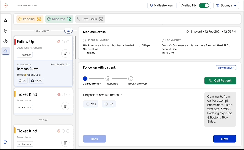
As the developers coded and created the dashboard, I collaborated with them to identify areas that could be improved based on the design. Below is the feedback I provided on the dashboard that was created in the initial iterations of the developed product.

👉 top bar and the tickets need to be left aligned
👉 Color updates for unselected button & medical updates box,
👉 notes box, call history missing needs to be added
👉 spacing between the ticket, side bar and scroll needs to be reduced
Developed version of the dashboard highlighting the feedback I provided
FUTURE SCOPE
Next steps would be to increase ticket types and use AI recommendations
After the ticketing system was launched the next step was to connect the doctors dashboard with the ticketing system. So as the availability of the doctors can be seen upfront. Along with this to integrate more types of tickets incorporating diverse tasks.
AI can also be used to appropriate analyze and recommend actions, reminders and responses during tele-consultation and interaction with the subscribers by the health assistants.
LEARNINGS
Reflecting working on this project
✍️ Involving the user through the process
As a designer I realized that testing the flow with the user throughout out the process of design was very helpful in identifying the specific areas that needed some tweeks based on user needs.
🤝 Collaborative work
As I worked on this project I was needed to coordinate with senior designers, developers and ship within a specific timeline. I was able to ship it within time and learnt to manage time efficiently.
💻 Enterprise design
While working on this project I got to explore and understand the design of enterprise applications, I realized that within the design of enterprise applications functionality and efficiency is given more priority over delight.

You made it till the end of this case-study!
VIEW MORE WORK
Healthcare
Shipped
Design System

Creator economy
Shipped
B to C
